
Views: 0 Author: Site Editor Publish Time: 2026-09-28 Origin: Site


A botched packaging print run costs real money and damages brand reputation. Muddy logos, unreadable text, and misaligned graphics ruin bulk orders instantly. Designing for corrugated cardboard differs fundamentally from designing for digital screens or standard commercial paper. Ink absorption, flute ridges, and substrate colors create unique prepress challenges. Achieving crisp, professional graphics requires strict adherence to specific technical artwork settings, precise color management, and a deep understanding of how different materials interact with wet ink. We see files fail on the press every day because designers treat corrugated board like a glossy magazine page. You have to engineer your files for the physical realities of flexographic and lithographic printing. This means managing dot gain, respecting the flute structure, and setting up your color profiles correctly before the plates are ever cut.
Resolution is Non-Negotiable: All raster images must be a minimum of 300 DPI at actual print size to prevent pixelation on large packaging surfaces.
Color Mode Dictates Accuracy: Artwork must be built in CMYK or utilize specific Pantone (PMS) spot colors; RGB files will result in unpredictable, muted color shifts when printed.
Material Alters Output: The substrate—whether unbleached kraft or coated white—drastically changes how ink renders, requiring specific contrast and color adjustments.
Vector Over Raster for Typography: Text, logos, and barcodes (like QR codes) must be vector-based to maintain sharp edges against the porous surface of corrugated cardboard.
Scalability is Essential: Designs must be built to scale proportionally across various pizza box sizes without losing resolution or structural alignment.
Corrugated cardboard presents a highly porous and uneven printing surface. When wet ink hits this unsealed paper, it spreads outward. We call this phenomenon dot gain. Fine details often blur together during high-speed production runs. You lose crisp edges on intricate designs. A logo that looks perfectly sharp on a digital monitor can easily become an illegible smudge on actual cardboard. The physical reality of the substrate dictates the limits of your graphic design. Prepress operators spend hours compensating for this spread by adjusting the artwork files, applying chokes and spreads to keep colors from bleeding into one another.
A design looks perfect on a backlit monitor operating in RGB color mode. However, a digital screen does not replicate flexographic or lithographic printing presses. Aesthetic quality does not equal print readiness. You must structure files specifically for physical production. Screen pixels emit light, while printing inks absorb light. This fundamental difference means visual files require extensive technical preparation before they ever reach the printing plate. If you send an unadjusted RGB file to a press, the raster image processor will force a conversion. That forced conversion strips the vibrancy right out of your design, leaving you with dull, lifeless packaging.
Cardboard contains internal wavy ridges known as flutes. Heavy ink coverage or overly delicate linework interacts poorly with these underlying ridges. High press pressure can easily crush the flutes during the printing process. This leads to uneven print distribution, banding, and compromised structural integrity. We refer to this visual defect as washboarding. The "flute crush" risk forces prepress technicians to carefully balance ink density against the physical strength of the corrugated board. You cannot simply flood a corrugated sheet with heavy ink without expecting the structural integrity of the board to suffer.
Flexographic printing uses flexible photopolymer plates to transfer ink onto the board. These plates have physical limitations. They cannot hold a dot smaller than a certain percentage, usually around 2% to 3%. If your artwork features a soft drop shadow or a very light gradient that fades to zero, the flexo plate will drop that edge abruptly. Instead of a smooth fade, you get a hard, jagged line where the plate simply stops transferring ink. Designing for packaging means understanding these mechanical thresholds and building your graphics to survive them.
You must maintain a strict 300 DPI rule for any photographic or raster elements. Upsampling low-resolution web images for print never works. The press simply prints larger, blocky pixels. If your source image is 72 DPI, changing the setting to 300 DPI in Photoshop does not magically create missing data. The file must originate at high resolution. Large packaging surfaces magnify poor image quality instantly. When a customer holds a box just two feet from their face, every jagged pixel stands out. High-resolution source files are the only way to guarantee photographic clarity.
Color management requires strict discipline. Use the 4-color process (CMYK) for complex, multi-color designs and photographic elements. For exact brand color matching, rely on Pantone Spot Colors. They provide solid, consistent coverage on packaging. RGB color profiles are strictly for digital screens. Submitting an RGB file to a commercial printer guarantees unpredictable, muted color shifts. Always convert and verify your colors in CMYK before finalizing the artwork for custom printed pizza boxes. Spot colors require their own dedicated printing plates, so you must label them correctly in your swatch library.
Typography and linework demand specific minimums. Set minimum point sizes for text carefully. Use 8pt to 10pt minimums to prevent ink fill-in on porous surfaces. Specify minimum line thickness between 0.5pt and 1pt. This ensures lines hold up during the heavy-duty printing process. Anything thinner risks disappearing entirely or breaking apart across the cardboard flutes. Reverse type—where text is knocked out of a solid color block—requires even larger point sizes and thicker weights. The surrounding ink will naturally spread into the negative space, choking out thin serif fonts.
Die-lines dictate the physical shape of the box. Standard bleed requirements usually extend 0.125" to 0.25" past this die-line. Bleed ensures ink reaches the very edge of the cut cardboard without leaving white margins. The Safe Zone sits inside the die-line. It ensures critical elements like logos and contact info stay away from edges. You do not want crucial branding cut off or folded over structural creases. Die-cutting machines have a mechanical tolerance. They shift slightly during production. Your bleed and safe zones absorb these minor shifts so the final product still looks perfectly centered.
Adapting a single design to fit 10-inch, 12-inch, and 16-inch boxes presents a major technical challenge. Raster images lose quality when stretched. Use vector-based master files for all core branding elements. Vector graphics rely on mathematical equations rather than static pixels. They will scale proportionally without distortion or resolution loss across entirely different die-lines. You must reposition elements manually for each box size rather than just scaling the entire file up. A logo that looks perfectly proportioned on a 10-inch lid might look entirely lost in the center of a 16-inch lid.
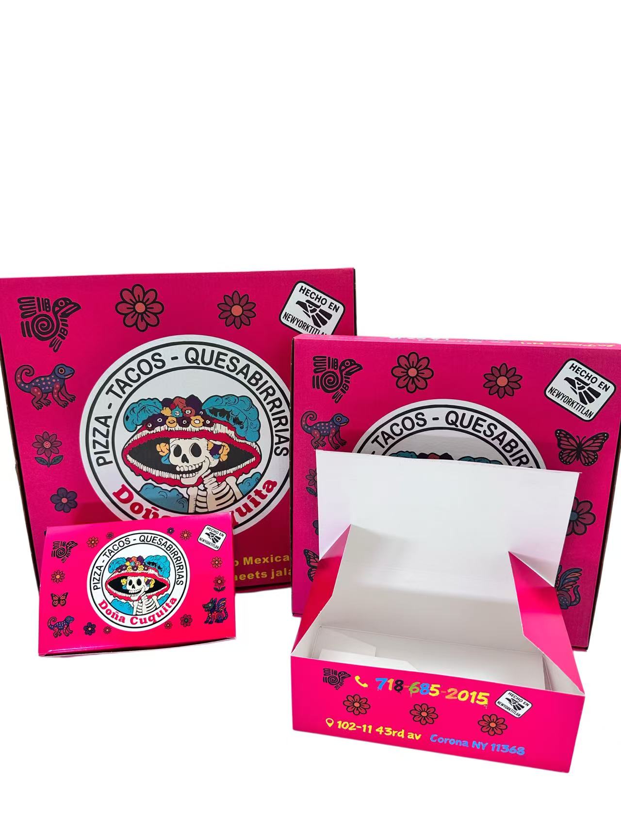
The brown, unbleached background of standard cardboard absorbs light aggressively. It alters ink hues significantly. Yellows become muddy and difficult to read. Blues often turn greenish due to the underlying yellow-brown tones of the paper. You need high-contrast designs when working with this material. Printing a solid white ink underbase becomes absolutely necessary if you require vibrant, accurate colors on kraft pizza boxes. This white layer acts as a primer, blocking the brown fibers from showing through and giving the top colors a neutral surface to sit on.
Bleached white corrugated board acts as the optimal substrate for bright colors and bold pictures. The white background allows for highly accurate CMYK reproduction. You do not need a white underbase. Colors pop naturally, and contrast remains sharp. This material handles complex photographic artwork much better than unbleached alternatives. However, bleached board still has a porous surface. You still have to account for standard dot gain, even if the color accuracy is vastly superior to unbleached board.
Grease-resistant coatings or waterproof laminations directly affect ink adhesion. Curing times increase because the ink cannot absorb into the paper fibers as easily. Glossy finishes make printed colors look more saturated and vibrant. Matte finishes soften the perceived saturation, providing a premium but muted aesthetic. Designing for waterproof pizza boxes requires specific ink formulations that bond properly with the coated surface. If the surface tension of the board does not match the ink, the graphics will bead up or scratch off easily during transit.
Sustainable options like 100% recycled corrugated materials interact differently with eco-friendly soy or water-based inks. Recycled fibers are shorter and more absorbent. Prepress settings require specific dot gain compensation to prevent images from looking too dark. Water-based inks have longer drying times and higher absorption rates. You must adjust color saturation levels to account for this rapid absorption. Recycled boards also contain more impurities and dust, which can occasionally cause small hickeys or voids in solid printed areas.
Material Type | Ink Absorption Rate | Color Accuracy | Dot Gain Expectation | Best Use Case |
|---|---|---|---|---|
Unbleached Kraft | Very High | Low (Colors shift dark/muddy) | 20% - 25% | Minimalist, single-color, high-contrast vector designs. |
Bleached White | Medium | High (Accurate CMYK) | 15% - 20% | Full-color graphics, photographs, complex logos. |
Coated / Waterproof | Low (Ink sits on surface) | Very High (Vibrant saturation) | 5% - 10% | Premium branding, grease-heavy products, frozen storage. |
100% Recycled Board | High | Moderate (Varies by batch) | 20% - 30% | Eco-friendly campaigns, rustic aesthetics, simple typography. |
Double-sided printing carries distinct technical constraints. Printing inside the lid introduces ink-transfer risks. We call this offsetting. Wet ink from the outside of one box can transfer to the inside of another when stacked heavily on pallets. You must use certified food-safe ink requirements when printing anywhere near the direct food contact surface. Proper drying times and specialized coatings help mitigate these risks. You also have to consider the structural integrity of the board; running a sheet through the press twice applies double the pressure to the flutes.
Strict settings apply for QR codes and scannable barcodes. They must be vector format to guarantee sharp edges. Print them in a single dark color, preferably 100% Black. Never build a barcode out of CMYK process colors, as slight registration shifts will render it unscannable. Place them on a high-contrast background. Avoid placing QR codes over structural folds or deep flute ridges. A scanner needs a perfectly flat, high-contrast surface to read the data matrix. If the code wraps around a corner or dips into a crushed flute, it fails.
Map your artwork carefully around structural vents and folding tabs. Always use the manufacturer's specific die-line template. A standard pizza box has multiple interlocking flaps. Graphics placed blindly might end up upside down or hidden entirely once the carton is folded into its final three-dimensional shape. Print out a miniature version of your design on standard paper, cut it out, and fold it. This physical mockup reveals orientation errors immediately before you spend money on printing plates.
Set up artwork files with dedicated, easily editable layers. This modular approach helps immensely with seasonal graphics or limited-time promotions. Keep structural elements, permanent branding, and promotional text strictly separated. Brands can update outer box graphics rapidly without altering the core structural template or risking accidental changes to the main logo. Lock the die-line layer so it never accidentally shifts during the design process. Keep your spot colors on their own isolated layers for easy prepress separation.
Direct box printing sometimes hits limitations during low-volume runs or budget constraints. Supplementary materials bridge this gap effectively. Use custom printed greaseproof paper inside the carton for an unboxing surprise. Apply exterior branded stickers to seal the lid securely. High-quality custom stamps also work well for localized, artisan branding on blank corrugated boards. These secondary packaging elements allow you to maintain a strong brand presence even when full-coverage flexographic printing isn't viable for a specific product line.
Export final files as high-resolution PDF/X-4 or PDF/X-1a formats. These specific industry standards lock in transparency settings and color data securely. They prevent unexpected shifts when the file moves from your design software to the printer's raster image processor (RIP). Avoid sending raw working files unless specifically requested by the prepress department. Raw files often contain hidden layers, unlinked assets, and color profile conflicts that cause major delays on the production floor.
Convert all typography to outlines or paths before saving the final file. This critical step prevents missing font errors at the print house. If you do not outline fonts, the printer's computer might substitute your custom brand font with a generic default. Embed all linked images directly into the document rather than leaving them as external dependencies that could get lost in email transit. A missing link means the press prints a low-resolution placeholder instead of your high-quality photograph.
Digital proofs (PDFs) differ drastically from physical hard-copy proofs. A backlit screen cannot show you true dot gain or flute crush. Request a physical proof for large volume orders. You must verify color accuracy, ink saturation, and structural alignment on the actual substrate before full production begins. Skipping the physical proof often leads to expensive reprints. Review the physical proof under standard daylight conditions, not just under the fluorescent lights of an office, to see exactly how the ink renders on the board.
Request an exact, scale-accurate die-line template from your chosen manufacturer before starting any design work.
Audit your current logo and branding files to ensure they are available in scalable vector formats.
Convert all critical text to outlines and verify your document color mode is set to CMYK or Pantone.
Consult directly with a prepress technician to confirm dot gain compensation for your specific board material.
Order a physical hard-copy proof to verify ink saturation and structural alignment before authorizing the full production run.
A: All raster images and photographs must be exactly 300 DPI at their actual print size. Lower resolutions will cause visible pixelation and blurriness. For logos, text, and barcodes, always use vector formats, as they possess infinite resolution and maintain perfectly crisp edges on corrugated surfaces.
A: No. RGB is exclusively for digital screens emitting light. Printing presses use physical ink, requiring CMYK or Pantone (PMS) color modes. If you submit RGB files, the printer's software will automatically convert them, resulting in unpredictable, muted, and often disappointing color shifts on the final product.
A: Unbleached kraft cardboard is brown and highly porous. The brown substrate absorbs light and mixes with the translucent printing inks, drastically altering the final hue. Yellows turn muddy, and blues shift toward green. You must use high-contrast designs or a white ink underbase to achieve accurate colors.
A: You must use vector graphics for your core design elements. Vector files scale mathematically without losing resolution. Always request specific die-line templates for each box size from your manufacturer. Do not simply stretch a raster image, as this causes severe distortion and pixelation.
A: The industry standard is a high-resolution PDF/X-4 or PDF/X-1a file. These formats lock in color profiles and transparency data. Alternatively, you can send Adobe Illustrator (.ai) or Encapsulated PostScript (.eps) files, provided you have embedded all linked images and converted all fonts to outlines.
A: The QR code must be a vector graphic printed in a single, dark solid color, preferably 100% Black. Never build it using CMYK process colors. Place it on a high-contrast, light background. Avoid placing the code over structural folds, seams, or deep cardboard flutes that distort the shape.
A: Yes. Grease-resistant coatings and waterproof laminations prevent standard inks from absorbing into the paper fibers. This requires specialized inks and longer curing times. The coating also affects visual output; glossy finishes increase color saturation, while matte finishes soften the overall look of the printed artwork.


