
Views: 0 Author: Site Editor Publish Time: 2026-10-21 Origin: Site


Designing packaging for the food industry requires strict technical discipline. When artwork moves from a digital monitor to a physical corrugated substrate, the variables shift dramatically. Submitting improperly formatted files causes severe operational risks. A botched print run means thousands of unusable units, delayed product launches, and wasted procurement budgets. Corrugated cardboard, food-safe inks, and high-speed flexographic presses behave differently than standard commercial paper printing. Colors shift, fine lines fill in, and structural folds can sever design elements. What looks flawless on a backlit screen often fails on the press if not prepared correctly. Implementing a rigorous preflight process mitigates these risks. By systematically verifying color spaces, resolution, structural alignment, and ink coverage, you ensure the digital artwork translates accurately to the physical packaging. This technical diligence protects brand integrity and ensures a seamless manufacturing process.
Color Space & Material Interaction: CMYK is mandatory for full-color prints, but substrate choice heavily dictates final color accuracy (e.g., ink absorption rates differ drastically between bleached board and natural fibers).
Resolution & Vector Dominance: Crisp printing on corrugated materials requires 100% vector graphics for logos/text and a strict minimum of 300 DPI for any rasterized elements.
Structural Precision: Accurate alignment with the manufacturer’s specific dieline—including precise bleeds, safe zones, and panel orientation checks—prevents critical design elements from being severed or printed upside down.
Compliance & Ink Limits: Total Ink Coverage (TIC) must be managed to prevent oversaturation, smudging, and violations of food-contact safety standards.
Marketing Functionality: Modern additions like QR codes require specific contrast, sizing, and quiet-zone formatting to remain scannable on porous corrugated surfaces.
Most corrugated packaging runs on flexographic presses. This process uses flexible photopolymer plates wrapped around rotating cylinders. An anilox roller transfers liquid ink onto the raised areas of the plate, which then stamps the image onto the cardboard. This mechanical process is fast and efficient but lacks the microscopic precision of digital or offset printing. The pressure of the plate hitting the board causes liquid ink to spread. This spread, known as dot gain, forces designers to compensate during the prepress stage. If you do not adjust your artwork for dot gain, mid-tones will print far darker than intended, and fine details will turn into solid blobs of ink.
Corrugated board consists of a fluted medium sandwiched between two flat linerboards. These flutes (typically B-flute or E-flute for food packaging) create a subtle ribbed texture on the surface of the board. When the printing plate presses against this textured surface, it creates a washboard effect. Solid blocks of color may show light and dark vertical bands corresponding to the flutes underneath. You must verify the flute direction on the manufacturer's dieline. Never run fine barcodes perpendicular to the flute direction. The washboard effect will distort the barcode lines, causing them to fail scanner grading. Always orient barcodes so the bars run parallel to the web direction of the press.
High-speed corrugated printing operates under intense physical constraints. Substrates move rapidly through heavy machinery. Minor mechanical shifts ranging from 1/16th to 1/8th of an inch happen constantly. Artwork must absorb these shifts gracefully. If a design relies on hairline registration between two touching colors without proper trapping, a 1/16th-inch shift exposes stark white gaps of unprinted cardboard. Preflighting identifies these vulnerabilities. Designers build in adequate chokes, spreads, and safe zones to mask inevitable mechanical movement.
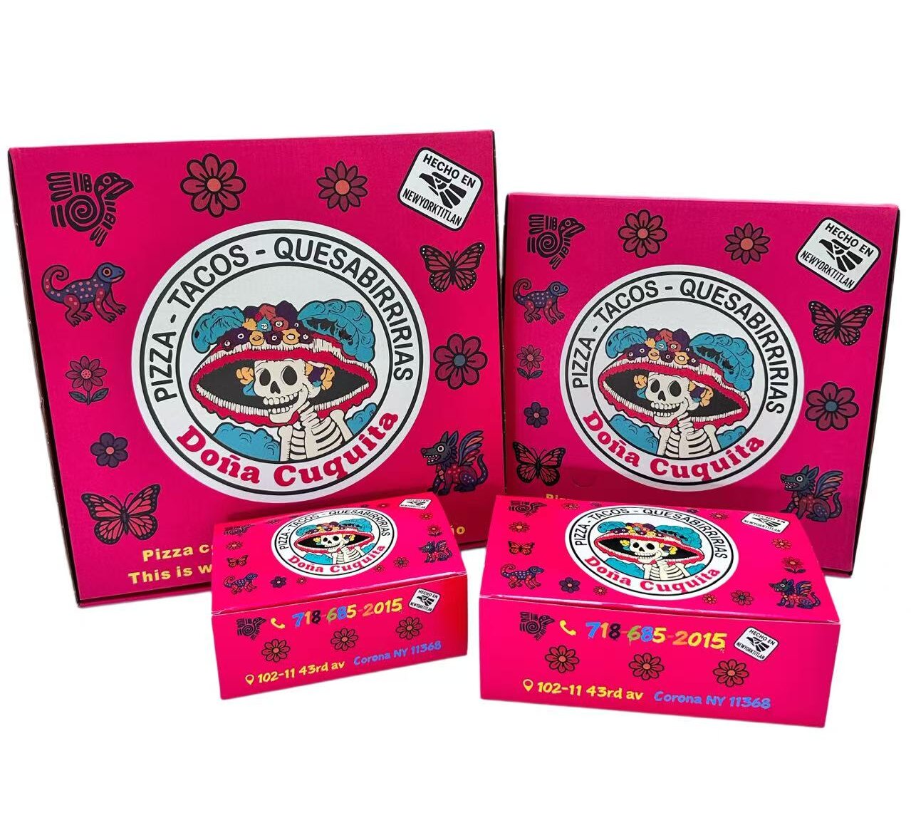
Digital screens emit light using the RGB color model. Printing presses absorb light using the CMYK subtractive color model. Submitting RGB files for physical packaging guarantees unpredictable color shifts. The prepress software automatically forces RGB values into the nearest CMYK equivalents, resulting in dull or incorrect colors. All artwork for custom printed pizza boxes must be natively designed and exported in CMYK.
Standard CMYK process printing mixes four inks to create a wide spectrum of colors. However, for precise brand matching, Pantone Matching System (PMS) spot colors are utilized. Spot colors are pre-mixed inks applied to the substrate, ensuring exact consistency across different print runs. Specifying exact PMS values is highly recommended for corporate logos and signature brand backgrounds.
Full CMYK printing requires four separate printing plates and four ink stations. Limiting designs to one or two spot colors drastically reduces flexographic plate costs. This minimalist approach simplifies the registration process on the press, resulting in a cleaner production run.
Because mechanical shifting is inevitable, you must implement trapping. Trapping is the practice of slightly overlapping adjacent colors to prevent unprinted white gaps from appearing if the press misregisters. When a light color touches a dark color, you spread the light color slightly into the dark color. The darker ink masks the overlap. If you have yellow text on a blue background, you apply a slight stroke (spread) to the yellow text. If you have blue text on a yellow background, you choke the yellow background slightly under the blue text. Standard trapping for corrugated flexo ranges from 0.5pt to 1.0pt depending on the press tolerances.
Raster graphics rely on a grid of pixels. For high-quality reproduction on corrugated materials, these images must maintain a strict minimum resolution of 300 Dots Per Inch (DPI) at 100% of their final printed scale. Dropping below this threshold causes the image to appear pixelated and blurry.
A common prepress failure involves upsampling low-resolution web graphics. Taking a 72 DPI image from a website and artificially forcing it to 300 DPI in Photoshop does not create new detail. It merely blurs the existing pixels over a larger area. The Raster Image Processor (RIP) will still output a degraded image. All photographic assets must be captured or rendered natively at high resolution.
Corrugated cardboard is highly porous. As liquid ink hits the surface, it spreads outward along the paper fibers. This phenomenon dictates strict minimums for typography and line weights. For standard positive text, a minimum of 10-point type is generally required. Serif fonts with delicate tails should be avoided, as the fine details will vanish.
Reverse or knockout text is particularly vulnerable. The surrounding dark ink will spread inward, threatening to fill in the negative space of the letters. Knockout text should be bold, sans-serif, and typically sized at 12 points or larger. Standard minimum line thickness guidelines require at least a 0.5 pt stroke for positive lines and a 1.0 pt stroke for reverse lines.
Printing QR codes on textured corrugated boards introduces severe implementation risks. Codes must be generated and placed as 100% vector graphics. Rasterized QR codes develop soft, anti-aliased edges that confuse smartphone camera sensors. The code must be printed in pure vector black (100% K) or a very dark, high-contrast spot color. Avoid building QR codes out of rich black (a mix of CMYK), as slight press misregistration will blur the sharp edges of the data modules.
Maintain a minimum physical size of 0.5 inches by 0.5 inches. Equally critical is the quiet zone—a clear, unprinted boundary surrounding the entire QR code. This negative space isolates the code from surrounding graphics, allowing the scanner to lock onto the positioning squares without interference.
Unbleached kraft board presents unique prepress challenges. The natural brown substrate acts as a heavy mid-tone background. It absorbs light and darkens all printed colors significantly. When designing for kraft pizza boxes, you must account for this color interference. Standard CMYK inks are translucent. The brown fibers will show through the ink, altering the hue. Cyan may appear greenish, and magenta may take on a muddy burgundy tone.
Standard printing processes do not include white ink. Any white areas in your digital design will simply be left unprinted, exposing the brown kraft board. If true white is required, a specific opaque white base layer must be configured as a spot color and applied via an additional print station.
Avoid using low-contrast colors such as pastels, light yellows, or soft grays. These shades lack the opacity to overcome the dark substrate and will completely disappear into the kraft material. High-contrast, dark spot colors yield the most reliable results on natural fibers.
Bleached white corrugated board offers excellent color fidelity. The white background reflects light through the translucent CMYK inks, allowing for bright, accurate color reproduction. However, specialized coatings change the prepress requirements.
When working with waterproof pizza boxes, the substrate is often treated with clay coatings or grease-resistant barriers. These non-porous surfaces drastically alter ink adhesion and curing times. Because the ink cannot absorb deeply into the paper fibers, it sits on the surface. This requires specific ink formulations and modified drying profiles to prevent smearing during the high-speed stacking process.
The finish of the waterproof coating impacts the final visual output. Gloss coatings increase color saturation and contrast, while matte coatings scatter light, resulting in a softer appearance. Preflighting for coated boards requires careful management of ink density to ensure the surface is not overloaded.
A dieline is the fundamental architectural blueprint of your packaging. It is a 2D vector file provided by the manufacturer that maps out exactly how the flat board will be cut, scored, and folded. Understanding the anatomy of a dieline is non-negotiable for prepress success. Dielines consist of specific color-coded strokes. Cut lines indicate where the steel rule die will slice through the board. Score lines indicate where the board will be creased to form hinges and flaps. Bleed boundaries dictate how far the artwork must extend beyond the cut lines.
Dieline Element | Standard Color Code | Function on Press |
|---|---|---|
Cut Line | Red Stroke | Indicates the exact path of the steel cutting blade. |
Score / Crease Line | Green Stroke | Indicates where the board will be crushed to create a folding hinge. |
Bleed Line | Blue Stroke | The outer boundary where all background artwork must terminate. |
Perforation | Dashed Yellow Stroke | Indicates a tear-away section or venting hole. |
Mechanical shifting during the die-cutting process is inevitable. If your artwork ends exactly on the cut line, a 1/16th-inch shift will result in a glaring white, unprinted edge on the final assembled product. To prevent this, all background colors, patterns, and images must bleed past the cut line. The standard bleed requirement for corrugated packaging is typically 0.125 inches to 0.25 inches.
Critical design elements like typography, logos, and regulatory information must be protected within the safe zone. The safe zone requires keeping these elements at least 0.25 inches away from all cut lines and score lines. Text placed too close to a score line may become distorted or unreadable when the cardboard is folded.
Visualizing a 3D object on a 2D canvas is notoriously difficult. A common prepress failure involves side panels or front lips printing upside down because the designer misunderstood how the flaps fold together. The front lip of the box, which tucks inside, often requires the artwork to be rotated 180 degrees on the flat dieline to appear right-side-up when assembled.
Establish a framework for visualizing the folded structure. Map out the top lid, bottom base, back hinge, side panels, and front tucks. Print a scaled-down version of the flat artwork on standard office paper. Physically cut and fold this paper mockup. This tangible verification immediately reveals if back hinges, side tucks, or interior flaps are oriented incorrectly before finalizing the high-resolution file.
Total Ink Coverage measures the combined percentage of cyan, magenta, yellow, and black inks applied to a single area. In commercial offset printing on coated paper, TIC can often reach 300%. Corrugated cardboard cannot absorb that volume of liquid.
For corrugated packaging, TIC limits are strictly capped between 240% and 260%. Exceeding this limit causes ink pooling, severe smearing, and offset transfer to adjacent boxes. Preflighting requires using the Output Preview tool in Acrobat to scan the document for areas exceeding the manufacturer's specified TIC limit and adjusting the color profiles accordingly.
Regulatory compliance dictates the use of low-migration, food-safe inks for any packaging in direct or indirect contact with consumables. The chemistry of the ink applied to a pizza box impacts both safety and sustainability.
The industry utilizes water-based and soy-based inks. These sustainable options interact differently with the substrate compared to traditional solvent-based inks. Water-based inks require precise drying times and specific press speeds to cure properly on porous boards.
Heavy ink coverage presents a significant risk of odor migration. If the outside panels are heavily saturated, the ink requires extensive curing. If the boxes are stacked and shipped before fully curing, volatile organic compounds or residual moisture become trapped. When a hot food item is placed inside, the heat and steam draw those unevaporated ink odors into the food product. Preflighting helps identify unnecessarily heavy ink builds, allowing designers to utilize screens or patterns to reduce overall ink volume and mitigate odor transfer risks.
Adobe Illustrator remains the industry standard for vector-based packaging design. When setting up your file, always place the manufacturer's dieline on a dedicated, locked layer at the very top of the layer stack. Set the dieline strokes to a spot color named "Dieline" and enable the "Overprint Stroke" attribute in the Attributes panel. This ensures the dieline does not knock out the artwork beneath it during the RIP process. Keep all text live until the final approval stage, then convert all typography to outlines to prevent missing font errors at the print facility.
Before sending the final PDF to the manufacturer, run it through Adobe Acrobat Pro's Print Production toolset. Open the Output Preview window. This tool allows you to simulate how the file will separate into individual printing plates. Toggle the CMYK and Spot color channels on and off to verify that your colors are separating correctly. Use the Total Area Coverage warning feature to highlight any zones in the artwork that exceed the 240% TIC limit. If areas light up in the warning color, you must return to Illustrator or Photoshop to reduce the ink density in those specific regions.
Before transmitting files to the manufacturing facility, execute a systematic verification of all technical nodes. Utilizing a structured checklist prevents costly oversight.
Preflight Node | Verification Action | Risk Mitigated |
|---|---|---|
Typography | Ensure all fonts are outlined or converted to curves. | Prevents missing font errors and unwanted font substitution at the RIP stage. |
Asset Links | Verify all linked raster images are embedded directly into the master file. | Prevents missing image links, which result in low-resolution placeholder printing. |
Color Mode | Confirm document color mode is strictly CMYK or designated Spot Colors. | Eliminates unpredictable color shifting and dull, muddy print results. |
Transparencies | Flatten all complex transparencies, drop shadows, and blending modes. | Prevents RIP processing errors that cause white boxes or jagged edges around graphics. |
Dieline Setup | Place the structural dieline on a separate layer and set the stroke to overprint. | Ensures the cut and score lines do not accidentally print onto the final packaging. |
Export Format | Generate a high-resolution, print-ready PDF (e.g., PDF/X-1a or PDF/X-4). | Locks in all structural and color data into an industry-standard, stable format. |
Execute the following actionable steps to finalize your packaging project and move into production:
Request a digital 3D mockup from your manufacturer to verify panel orientation and overall layout aesthetics.
Order a physical, unprinted structural sample to test the folding mechanics, board strength, and internal dimensions with your actual product.
Print a scaled paper mockup in your office to physically verify that all bleeds, safe zones, and text orientations align with the folding structure.
Request a printed drawdown proof to verify spot color accuracy on your chosen corrugated substrate before authorizing full plate production.
A: All raster images, such as photographs or textured graphics, must be set to a minimum of 300 DPI at 100% scale. Critical elements like typography, logos, and barcodes should always be built as 100% vector graphics to ensure perfectly crisp edges on the porous corrugated board.
A: Screens use RGB light, while printing uses CMYK inks. Unbleached kraft board acts as a dark mid-tone background. Because standard printing inks are translucent, the brown substrate shows through, darkening the inks and altering their hue. True white cannot be printed on kraft without a specialized opaque base layer.
A: No. RGB is exclusively for digital screens. Physical printing presses utilize CMYK or Pantone spot colors. If you submit an RGB file, the prepress software will automatically convert it to CMYK, resulting in unpredictable, dull, and muddy color shifts on the final product.
A: A dieline is a flat, 2D vector template provided by the manufacturer. It acts as the architectural blueprint for the box, showing the exact locations of cut lines, score lines, and the required bleed boundaries. Artwork must be precisely aligned to this template.
A: Waterproof boxes feature clay coatings or grease-resistant barriers that create a non-porous surface. This prevents ink from absorbing into the paper fibers. Specialized inks and modified curing processes are required to prevent smudging and offsetting during high-speed production and stacking.
A: QR codes must be formatted as 100% vector graphics and printed in a high-contrast color, preferably pure black. Maintain a minimum size of 0.5 by 0.5 inches and ensure a clear, unprinted quiet zone around the entire code to prevent scanning interference.


