
Views: 0 Author: Site Editor Publish Time: 2026-07-15 Origin: Site


The pizza delivery market is saturated with commoditized white and kraft brown corrugated boxes, making visual differentiation at the point of delivery increasingly difficult. High-end and artisanal pizzerias struggle to visually justify premium menu positioning and build brand equity when their product arrives in the exact same generic packaging as budget competitors. You cannot sell a high-hydration, wood-fired artisan pie and deliver it in a flimsy, unbranded kraft container without creating a massive disconnect in consumer expectations. Transitioning to a custom black takeaway box shifts the packaging from a simple functional vessel to a strategic marketing asset. Dark packaging signals quality, drives social sharing, and anchors a premium brand identity right at the customer's doorstep. It transforms a standard delivery handoff into a memorable dining experience, immediately changing how the consumer perceives the value of the food inside before they even open the lid.
Visual Differentiation: Black pizza packaging leverages color psychology to communicate luxury, allowing operators to command higher price elasticity and visually separate from legacy chains.
Technical Viability: Implementing dark packaging requires strict adherence to food-safe, low-migration inks and specialized grease-resistant coatings to prevent chemical transfer and structural degradation.
Cost vs. ROI: While unit costs for a premium pizza box are higher due to specialized printing and materials, the offset is realized through increased customer retention, unboxing aesthetics, and turning customers into organic social media brand ambassadors.
Sustainability Realities: Procurement teams must navigate the complexities of recycling dark cardboard, specifically addressing local facility capabilities regarding carbon black inks.
Packaging serves as the first physical touchpoint between your restaurant and the consumer. Defining what makes packaging feel premium involves analyzing perceived value, anticipation, and brand consistency. A dark exterior immediately resets customer expectations. When you hand over a dark, sleek container, you communicate that the contents require respect and attention.
Dark color palettes in food packaging historically correlate with gourmet, artisanal, or exclusive product lines. Consumers naturally associate black with sophistication, authority, and high quality. When a customer receives a Black Pizza Box, their brain anticipates a superior culinary experience. This psychological trigger allows operators to push price elasticity further than they could with standard packaging.
Upgrading your packaging justifies a stronger market position. It allows you to separate your operation from volume-driven slice shops that compete solely on volume. Customers are more willing to accept a higher check average when the entire experience feels elevated. The box itself becomes a silent ambassador for the quality of the ingredients inside, reinforcing the value of imported cheeses, San Marzano tomatoes, and long-fermentation doughs.
We eat with our eyes first, and the visual contrast of vibrant food against a dark background is striking. Bright melted cheese, rich red sauce, and fresh green basil pop visually when framed by black pizza packaging. This contrast directly impacts user-generated content and organic marketing efforts.
Designing the unboxing moment turns customers into active brand ambassadors. When the presentation looks incredible, people take photos and share them on social channels. This organic reach is invaluable for modern pizzerias looking to dominate their local market.
Dark backgrounds eliminate visual distractions in food photography, forcing the eye directly to the product.
High contrast makes ingredient colors appear significantly more saturated and appetizing on camera.
Unique packaging encourages unboxing videos on social platforms, extending brand reach.
Customers tag the restaurant more frequently when the presentation stands out from the standard delivery experience.
Dark borders frame the circular shape of the pie, creating a natural vignette effect.
Consider historic campaigns from major pizza chains where limited-edition dark packaging successfully rewrote brand perception. It builds viral hype and commands market attention. You can replicate this strategy on a local or regional scale by committing to a bold visual identity that refuses to blend in with the stack of white boxes in the delivery driver's bag.
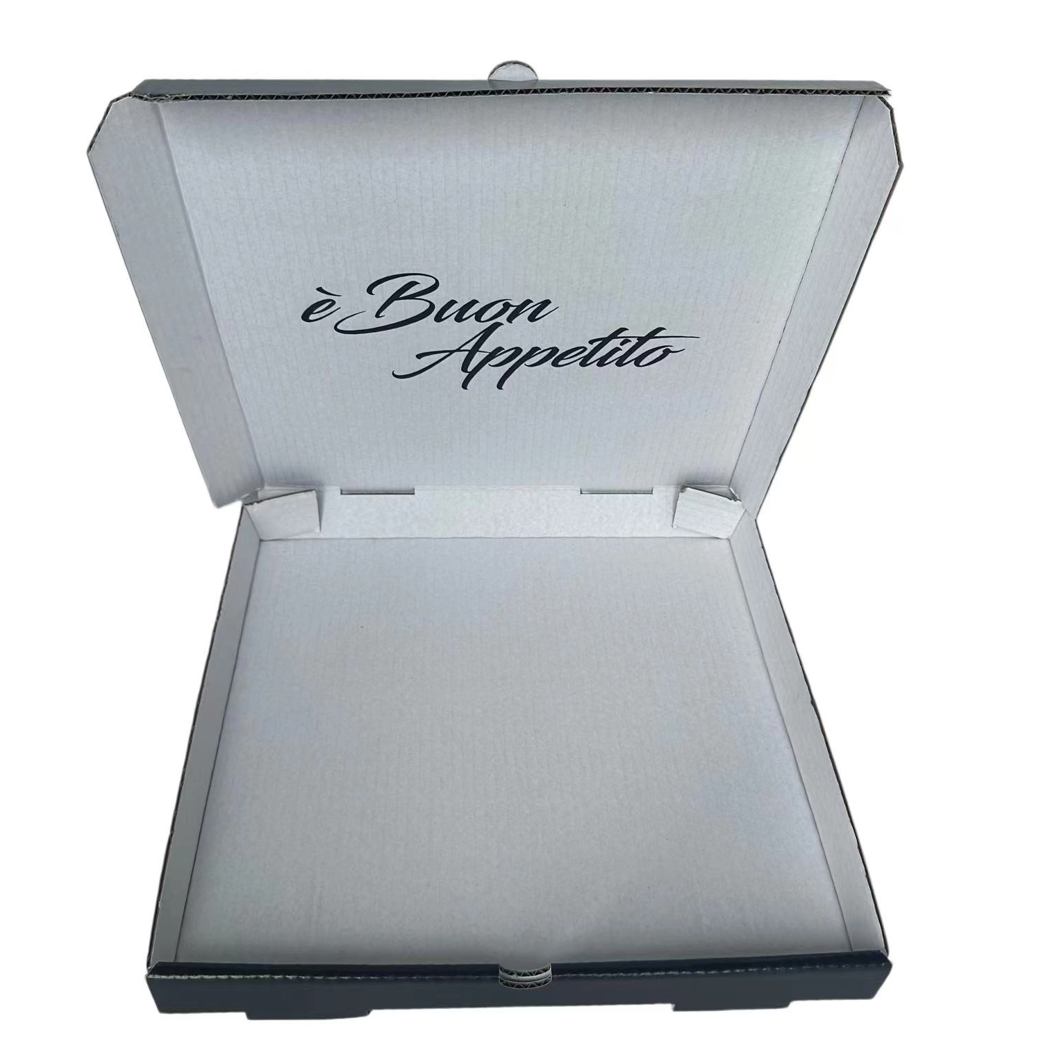
Achieving a flawless dark exterior requires specific manufacturing methods. You cannot simply flood a standard kraft box with cheap ink and expect it to perform under the harsh conditions of food delivery. Technical specifications matter greatly for food safety, structural performance, and visual consistency.
Safety is the primary concern when printing heavy coverage on food packaging. You must evaluate the necessity of soy-based or water-based low-migration inks. These inks ensure zero chemical transfer to the food, even under high heat and humidity. The ink must cure completely to prevent any odor from affecting the aroma of the pizza.
Specialized interior coatings are equally critical. Clay coatings or poly-blends prevent grease from soaking into the board. If grease penetrates the paper fibers, it compromises the structural integrity of the box. A greasy, sagging box instantly destroys the premium aesthetic you worked hard to build. We often see operators fail here by choosing a cheap board that looks great dry but collapses into a soggy mess after ten minutes in a hot delivery bag.
Printing on both the exterior and the interior lid maximizes brand impact. A double sided printed pizza box allows you to surprise the customer upon opening. You can reveal a contrasting color, share your brand story, or provide reheating instructions right where the customer is looking.
Tactical messaging placement keeps the customer engaged. Utilize the inner lid and side flaps for custom branding. Add your slogans, QR codes, or social media call-to-actions to drive repeat orders and build loyalty.
Place interior QR codes linking directly to your proprietary ordering app to bypass third-party delivery fees.
Use bold typography to display the brand motto on the inner lid for immediate impact upon opening.
Apply contrasting bright colors on the inside to frame the pizza and enhance the visual pop of the ingredients.
Print clear, step-by-step reheating instructions directly on the flap to ensure day-two quality remains high.
Include a call-to-action encouraging customers to post a photo and tag your specific social media handles.
Technical requirements for dual-sided registration are strict. The manufacturer must align the prints perfectly. Curing times may increase to ensure neither side smudges during the folding process, requiring a partner with advanced flexographic or lithographic capabilities.
Thermal properties vary between dyed corrugated board and standard kraft. You must analyze how well the dark board retains heat during transit. The box must keep the pizza hot without trapping excessive moisture, which requires precise ventilation engineering.
Flute types play a major role here. B-flute and E-flute are common choices. You must ensure the chosen flute maintains rigidity when saturated with dark inks and steam from the hot pizza. A collapsed lid ruins the toppings and the customer experience. E-flute offers a smoother printing surface for high-end graphics, while B-flute provides superior stacking strength for large delivery orders.
Performance Metric | Standard Kraft Corrugated | Premium Dark Corrugated |
|---|---|---|
Visual Contrast | Low (blends with crust) | High (makes toppings pop) |
Perceived Value | Commodity / Budget | Gourmet / Artisanal |
Ink Coverage | Minimal (Logos only) | Heavy (Full flood or dyed board) |
Grease Visibility | Highly visible stains | Masked by dark exterior |
Print Surface Quality | Porous, prone to bleeding | Sealed, sharp vector lines |
How you design the exterior dictates the final brand outcome. Specific design choices on dark backgrounds translate directly to consumer perception. You need a strategic framework to maximize visual impact without creating a cluttered, unreadable mess.
Utilizing negative space effectively is non-negotiable. Cluttered designs fail on dark backgrounds. They become muddy and hard to read from a distance. Minimalism works best when dealing with a premium pizza box. You want the customer's eye drawn immediately to your core brand identifier.
There is a massive operational advantage to using single-color vector graphics. White or metallic inks provide striking visual impact against a dark flood coat. This approach creates a clean, modern aesthetic. It ensures your logo is immediately recognizable, even in low-light delivery situations on a customer's front porch.
Primary logo placement requires careful thought. Utilize the center-top real estate of the box to anchor immediate brand recall. This is the focal point when the delivery driver hands over the order. Do not hide your logo in the corner; own the center space.
Secondary assets should integrate smoothly without fighting the primary logo for attention. Place unique slogans, brand mottos, and custom typography on side panels. Use the closure flaps effectively. This ensures 360-degree brand visibility during transit, whether the box is being carried down the street or sitting on a counter at a party.
Evaluate geometric print styles and retro-modern vector art. Bold typographic layouts pop beautifully against solid dark backgrounds. These styles resonate well with modern consumers who appreciate design-forward restaurant branding.
Adapting package designs helps future-proof your brand aesthetic. Shift away from generic Italian chef caricatures and cliché checkered borders. Move toward sleek, contemporary visuals that align with shifting consumer expectations in the gourmet food sector. Think of your packaging as a streetwear drop rather than a traditional restaurant supply item.
The finish of the board alters its tactile feel and performance. Evaluate matte versus gloss finishes carefully based on your operational environment.
Matte finishes offer modern, understated luxury but can show greasy fingerprints if not coated properly.
Gloss finishes provide high-visibility and natural moisture resistance, making them ideal for high-volume delivery.
Spot UV coating highlights specific logo elements, creating a premium textural contrast against a matte background.
Foil stamping adds a distinct, high-end metallic shine that catches the light during the unboxing process.
These embellishments elevate the tactile experience. When a customer touches a textured, sturdy container, it reinforces the premium positioning of the food inside before they even taste it.
Balancing the upfront investment against long-term brand equity requires careful planning. You must evaluate how custom packaging scales with your daily operations and storage capabilities.
Breaking down the differences between generic kraft containers and fully customized packaging involves looking at ink requirements, plate setups, and specialized board sourcing. You are investing in a marketing tool, not just a transport container. The cost delta must be viewed through the lens of customer acquisition and retention.
Calculate the value based on projected increases in average order value and customer lifetime value. When customers perceive higher quality, they order more frequently and are less sensitive to menu price increases. A slight bump in packaging costs is easily absorbed if it allows you to raise your pie prices by a dollar while simultaneously increasing repeat order frequency.
Navigating manufacturer minimum order quantities is a critical operational step. Custom dyed or heavy-ink runs often require larger production volumes to justify the setup time on the printing press. You must communicate with suppliers to understand their specific volume requirements and lead times.
Warehousing considerations are equally important. You must balance bulk order production against your available storage footprint. Heavy ink boards need to be stored in dry, climate-controlled environments to prevent warping or ink offsetting before use. If you lack space, negotiate split shipments with your supplier to manage cash flow and physical inventory.
Identifying where the transition to dark packaging can fail operationally saves time, money, and brand reputation. You must proactively address environmental, physical, and logistical risks before rolling out a new design.
The carbon black problem is a known issue in waste management. Some optical sorting machines at recycling facilities fail to recognize dark plastics and cardboards. They use infrared light, which standard carbon black absorbs, causing the item to be rejected and sent to a landfill.
To mitigate this, source from manufacturers that use NIR-detectable inks. Alternatively, look for explicitly compostable dark dyes. This maintains your eco-friendly credentials while delivering a premium look, ensuring you don't alienate environmentally conscious consumers.
Heavy ink coverage carries specific physical risks. It can lead to distinct chemical odors if rushed off the press. It might also rub off on hands, clothing, or car upholstery if not cured properly. This ruins the customer experience instantly and leads to complaints.
Specify aqueous coatings or varnishes to seal the ink. Require your manufacturer to conduct quality assurance testing for rub-resistance before approving full production runs. A simple rub test on a sample run ensures the ink stays on the board, not on the customer.
Specialty boards and inks are more susceptible to supply chain disruptions than standard kraft materials. If your primary supplier faces a shortage of dark corrugated board, you cannot revert to white boxes without confusing your customers and damaging your brand consistency.
Establish secondary supplier relationships early. Maintain a higher safety stock of packaging inventory than you would for generic supplies. This buffer protects your brand presentation during unforeseen market shortages or shipping delays.
Audit your current packaging inventory and evaluate your visual branding gaps to determine if your presentation matches your food quality.
Request physical samples of dark corrugated board from three distinct suppliers to test grease resistance and heat retention firsthand under real delivery conditions.
Commission a minimalist design mockup using white or metallic vector graphics to gauge internal stakeholder buy-in.
Run a limited-time pilot program with the new packaging to measure social media engagement and customer feedback before executing a full operational rollout.
A: Yes, provided they are manufactured using FDA-approved, low-migration inks and feature a food-grade interior barrier. The interior should remain unprinted or use specialized water-based inks to prevent any chemical transfer to the hot food.
A: Not inherently. Moisture retention depends on the ventilation design and the flute type of the corrugated board, not the exterior color. Proper steam vents are required regardless of the box color to maintain crust integrity.
A: It depends on local facilities and the ink used. Standard carbon black inks are often missed by recycling scanners. Using NIR-detectable inks or ensuring the board is compostable solves this environmental issue.
A: White, metallic gold, and metallic silver offer the highest contrast and readability. Single-color vector designs in these shades provide a clean, premium aesthetic without the muddiness of CMYK printing.
A: It should not, if manufactured correctly. You must specify an aqueous coating or varnish to seal the exterior ink. Always request a rub-resistance test from your supplier before mass production.


