
Views: 0 Author: Site Editor Publish Time: 2026-08-15 Origin: Site


Restaurant operators often face a frustrating operational reality. You invest heavily in a cohesive brand identity, carefully selecting the perfect shades for your logos and marketing materials. Then, the first pallet of packaging arrives. Your signature brand red looks muddy, your vibrant orange appears faded, and the crisp graphics look blurred. Inconsistent color reproduction on packaging directly undermines brand equity and makes franchise locations look disjointed. When customers receive branded pizza packaging with precise, vibrant colors, the dining experience feels intentional. It establishes your operation as a real brand. Conversely, poor color matching reduces the perceived quality of the food inside before the box is even opened. Achieving accurate color on corrugated cardboard represents a significant technical challenge. It is not merely a design preference. We will evaluate how a competent custom pizza boxes manufacturer manages substrates, printing methods, and finishes to guarantee brand consistency.
Substrate Dictates Fidelity: The base material (Kraft brown vs. bleached white corrugated board) fundamentally alters how ink is absorbed and displayed; exact matching requires substrate-specific color profiling.
Print Method Matters: Flexographic, litho-lamination, and digital printing offer different tiers of color accuracy, cost, and scalability for custom printed pizza boxes.
Color Systems Must Align: Designing in RGB for screens guarantees print failure; artwork must be built in CMYK or utilize specific Pantone (PMS) spot colors for accurate reproduction.
Finishes Alter Perception: Protective coatings, such as those used on varnish finish pizza boxes, shift the final visual output by changing how light reflects off the printed surface.
Defining a successful color match in the packaging industry requires objective measurement rather than subjective visual checks. Professionals use a metric called Delta E to quantify the mathematical difference between two colors. A Delta E value of less than two is generally imperceptible to the human eye under standard lighting conditions. However, corrugated board is a notoriously difficult medium. The uneven surface and porous nature of the material mean that maintaining a tight Delta E tolerance requires precise press calibration.
Acceptable variances in corrugated packaging often hover around a Delta E of three to five. Understanding this baseline sets realistic expectations for your final product. When you walk onto a production floor, you quickly realize that hitting a Delta E of two on a flat, glossy sheet of paper is standard practice. Hitting that same metric on a textured piece of B-flute corrugated board requires an experienced press operator constantly adjusting ink flow and pressure.
The base material heavily influences the final appearance of printed ink. Corrugated board consists of a fluted medium sandwiched between two flat linerboards. The top linerboard acts as your printing canvas. Kraft paper provides a natural, rustic brown background. Mottled white offers a slightly brighter surface with visible fibers, while bleached white liners provide the cleanest, most neutral canvas. Each substrate interacts with liquid ink differently.
Uncoated cardboard acts like a sponge. When ink hits the surface, it spreads outward through the paper fibers before drying. This phenomenon is known as dot gain. Dot gain causes halftone dots to expand, leading to darker and less vibrant colors. This physical reality explains why a Pantone color printed on brown Kraft paper will never perfectly match that exact same Pantone ink printed on a glossy, coated takeout menu. The underlying brown tone mixes with the translucent ink, fundamentally altering the hue. If you print a bright yellow on Kraft board, it will inevitably shift toward a muddy mustard color unless you lay down a layer of opaque white ink first.
Most standard commercial printing utilizes the four-color process known as CMYK (Cyan, Magenta, Yellow, and Key/Black). The press layers tiny dots of these four colors at varying angles to create a wide spectrum of shades. However, CMYK has strict limitations on corrugated substrates. It struggles to reproduce highly specific brand colors, such as neon greens, vibrant oranges, or specific corporate blues. The dot gain on porous paper makes CMYK builds look muddy.
When exact color matching is non-negotiable, a manufacturer will recommend using Pantone Matching System (PMS) spot colors. Instead of mixing dots on the board, the ink is pre-mixed in an ink kitchen to an exact recipe before it goes on the press. A dedicated printing plate applies this solid, opaque color directly to the box. Paying for dedicated PMS spot color plates ensures your brand colors remain consistent, regardless of minor press fluctuations. The operator only has to monitor the density of one solid color rather than balancing the registration of four separate CMYK plates.
Color accuracy does not exist in a vacuum. It must work alongside your logo, slogans, and typography to create a cohesive packaging design. A vibrant red background means nothing if the white typography printed over it becomes illegible due to poor registration. The structural design of the box, the placement of the graphics, and the chosen colors must align perfectly.
Intentional design accounts for the physical folds, the vent holes, and the way the box sits under standard restaurant lighting. For example, if your primary brand color spans across a fold line, the ink may crack when the box is erected. A skilled structural designer will adjust the artwork to ensure heavy ink coverage avoids high-stress crease areas. Furthermore, the flute profile of the board impacts the print. Thicker flutes, like C-flute, often cause washboarding, where the high and low points of the flutes create visible bands in solid printed areas. Switching to a tighter E-flute or B-flute provides a smoother surface for better color laydown.
Premium manufacturers separate themselves from low-tier vendors during the pre-press phase. The first step involves native color formatting. Artwork must be built natively in CMYK or designated with specific Pantone codes. Submitting RGB files guarantees a print failure because RGB is a light-based color model used for digital screens. CMYK is an ink-based model used for physical printing.
Technical file setup also requires strict adherence to physical boundaries. Manufacturers require artwork to feature a bleed line. This means extending the background color at least an eighth of an inch beyond the actual cut line. This prevents unprinted white edges if the cardboard shifts slightly during the die-cutting process. Conversely, all text, logos, and slogans must remain inside the safe margin. Keeping essential elements away from the edges ensures nothing gets accidentally sliced off on the production line.
A proper pre-press workflow includes several mandatory checks:
Converting all RGB elements to CMYK using the correct ICC color profile for uncoated board.
Trapping the artwork to ensure slight overlaps between adjacent colors, preventing white gaps if registration shifts.
Checking minimum line weights and font sizes to ensure they will not fill in or disappear due to dot gain.
Verifying that barcodes and QR codes are printed in a single solid color for maximum scannability.
If you look at the bottom flaps of commercial packaging, you will often see a row of small colored squares and crosshairs. These are color scales and registration marks. A common misconception suggests these blocks are simply a waste of ink. In reality, they are essential quality assurance tools used directly on the factory floor.
Press operators use these scales during the production run to measure ink density with a handheld spectrophotometer. They verify that the cyan, magenta, yellow, and black plates align perfectly over the crosshairs. If the registration shifts by even a millimeter, the image becomes blurry. By monitoring these hidden blocks, operators maintain strict consistency from the very first box off the line to the ten-thousandth. They pull samples every hour, measure the color blocks under standardized D50 lighting, and make micro-adjustments to the press to keep the Delta E within the approved tolerance.
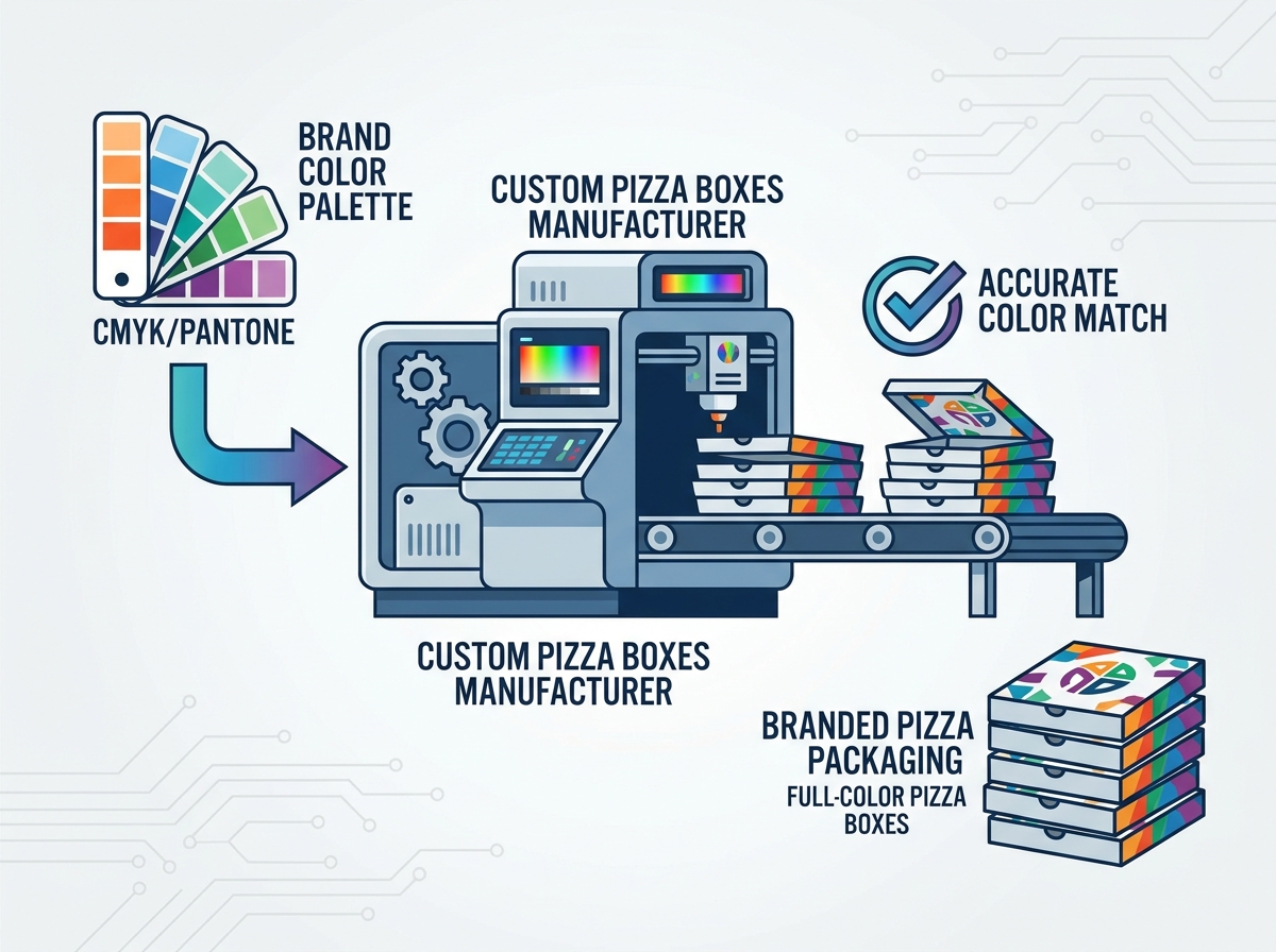
Selecting the right printing technology directly impacts volume capabilities, unit costs, and color fidelity. Comparing the primary methods helps operators choose the best approach for their specific custom printed pizza boxes. The decision often comes down to the complexity of your artwork and the scale of your operation.
Comparison of Printing Methods for Corrugated Packaging
Printing Method | Color Fidelity | Best Use Case | Production Speed |
|---|---|---|---|
Flexographic (Flexo) | Moderate (Best for solid spot colors) | High-volume runs with 1-3 simple colors | Very High (Up to 10,000 units/hour) |
Litho-Lamination (Litho) | Excellent (Photographic quality) | Premium brands requiring complex graphics | Medium (Requires multi-step lamination) |
Digital Printing | Good (Struggles with exact Pantone matches) | Short runs and variable data printing | Low to Medium (Depends on press size) |
Flexography operates like a massive, high-speed rubber stamp. Flexible polymer plates pick up water-based ink from an anilox roll and press it directly onto the corrugated board. The anilox roll contains thousands of microscopic cells that meter the exact amount of ink transferred to the plate. Controlling the cell volume on this roll is how a manufacturer controls the color density.
Pros: It is highly cost-effective for massive volume. The presses run at incredible speeds, making it the standard for most regional and national chains. Once the plates are mounted and the ink is dialed in, the machine can churn out thousands of identical boxes with minimal downtime.
Cons: Flexo has lower resolution compared to other methods. It struggles to reproduce complex gradients or highly detailed photographic images. There is also a higher risk of registration errors where colors overlap incorrectly. It performs best when utilizing one to three solid spot colors with clear separation between the design elements.
Litho-lamination represents the gold standard for visual fidelity. Instead of printing directly onto the bumpy corrugated board, the artwork is printed onto a smooth, high-quality paper liner using offset lithography. This printed liner is then glued, or laminated, directly to the corrugated flute using specialized machinery.
Pros: This method delivers true photographic quality and exact color matching. It allows for tight registration, complex gradients, and vibrant full-color pizza boxes that stand out in a crowded market. Because the printing happens on smooth paper before it touches the flutes, washboarding is completely eliminated.
Cons: The multi-step process requires higher minimum order quantities. It also carries higher unit costs and longer lead times compared to standard flexo printing. The added weight of the laminated top sheet can also slightly increase shipping costs.
Digital printing functions much like a large-scale office inkjet printer. It sprays microscopic droplets of CMYK ink directly onto the board without the need for physical printing plates. The technology has advanced rapidly, allowing for direct-to-corrugated printing with impressive resolution.
Pros: There are zero tooling or plate costs. This makes it excellent for short runs, seasonal promotions, or testing new markets. It also allows for variable data, meaning you can print different localized branding or unique promotional slogans on every single box in a batch without stopping the press.
Cons: Digital presses run significantly slower than flexo at high volumes. This results in a higher cost-per-unit at scale. Furthermore, digital CMYK cannot hit specific Pantone spot colors as accurately as litho or flexo. If your brand relies on a highly specific neon or metallic color, digital printing will likely fall short.
Functional requirements heavily impact aesthetic outcomes in food packaging. A box must retain heat and resist grease while still looking visually appealing. Applying a coating changes how light reflects off the printed surface, thereby altering the perceived color. You must account for this shift during the design phase.
When evaluating varnish finish pizza boxes, you must choose between gloss, matte, or satin. A gloss varnish deepens colors, increases contrast, and makes the artwork pop. It reflects light directly back at the viewer. A matte varnish softens the colors, flattens the contrast, and provides a modern, understated look by scattering the light. Beyond aesthetics, varnishes serve a dual purpose. They lock in the ink to prevent smudging during transit. More importantly, they provide a protective barrier against pizza grease that would otherwise soak into the paper and ruin the visual design.
Many modern brands prefer raw, uncoated finishes to communicate a commitment to sustainability. While eco-friendly packaging appeals to consumers, it requires managing visual expectations. Uncoated boards absorb more ink, resulting in a muted, softer appearance. The natural fibers of the paper remain exposed, which can cause slight variations in color from one batch of paper to the next.
To compensate for this, designers must adjust brand colors during the pre-press phase. You may need to select a slightly brighter or more saturated Pantone color to ensure the final printed result matches your original intent once the ink dries and sinks into the raw paper fibers. Working closely with the ink technicians at your manufacturing facility is the only way to dial in these adjustments accurately.
One of the most common procurement pitfalls involves digital proofs. Approving a digital PDF proof on a backlit monitor and expecting the physical cardboard to look identical is a massive risk. Computer monitors emit light using RGB, making colors look artificially bright and vibrant. Cardboard absorbs light using CMYK ink. The physical properties of the two mediums are entirely incompatible.
To mitigate this risk, never rely solely on a screen. Always request a physical drawdown before authorizing full production. A drawdown involves the manufacturer mixing the specific ink formula and applying it directly to the actual substrate you intend to use. This provides a completely accurate representation of how the color will look in real life under standard lighting conditions.
A frequent frustration occurs when the first order looks perfect, but a reorder six months later arrives a shade off. This inconsistency dilutes the intentionality of the brand. It often happens due to worn flexographic plates, different ink batches, or changes in the paper liner supplier. Even a slight change in the moisture content of the cardboard can affect how the ink lays down.
Mitigate this by contractually agreeing on acceptable color variances using Delta E measurements. Ensure your manufacturer keeps physical master samples on file in a dark, climate-controlled environment. These master samples serve as the definitive benchmark for all future production runs. When a new run begins, the operator pulls the master sample and compares it directly to the new boxes coming off the line.
Achieving incredibly bright colors sometimes requires inks that contain heavy metals or toxic compounds. Using these inks on food packaging violates FDA and local food contact regulations. The safety of the consumer always supersedes aesthetic desires. You cannot compromise food safety for a slightly brighter shade of red.
Ensure your manufacturer strictly uses compliant water-based or soy-based inks. Understand that there may be slight vibrancy trade-offs required to maintain food safety. A competent manufacturer will navigate these chemical limitations while still delivering a highly accurate brand match. They will source high-pigment, food-safe inks that provide excellent coverage without risking chemical migration into the food.
Delta E Tolerance Guidelines for Packaging
Delta E Value | Visual Perception | Industry Standard Application |
|---|---|---|
< 1.0 | Not perceptible to human eye | High-end cosmetics, luxury goods |
1.0 - 2.0 | Barely perceptible under close inspection | Premium litho-laminated packaging |
2.0 - 3.0 | Perceptible at a glance | Standard acceptable range for flexo printing |
> 4.0 | Clearly different colors | Unacceptable for strict brand matching |
A custom packaging manufacturer absolutely can match brand colors accurately. Success depends entirely on understanding the physical limitations of the corrugated substrate and selecting the appropriate printing method. Brands must choose between the cost-efficiency of flexo with spot colors or the high-fidelity photographic quality of litho-lamination. When vetting potential manufacturing partners, prioritize transparency. Shortlist vendors who willingly offer physical drawdowns and openly discuss substrate limitations. Look for facilities that utilize in-line color measurement tools to guarantee batch-to-batch consistency.
Take the following steps to ensure your next packaging run meets your brand standards:
Audit your current packaging artwork to verify it is built natively in CMYK with proper bleed margins.
Determine your required print volume to narrow down the most cost-effective printing method.
Request physical substrate samples from your shortlisted manufacturers to evaluate ink absorption firsthand.
Require a physical ink drawdown on your chosen substrate before signing off on full production.
A: Digital designs are viewed on backlit screens using RGB light, making colors appear artificially bright. When ink is applied to porous corrugated cardboard, a phenomenon called dot gain occurs. The ink spreads and absorbs into the paper fibers, resulting in a darker, less vibrant physical print.
A: Yes, but it requires specific printing methods. Standard flexographic printing cannot handle complex gradients or high-resolution photos. To achieve photographic quality, you must use litho-lamination or high-end digital printing, which offer much higher resolution and tighter color registration.
A: These blocks are color scales and registration marks. They are not a waste of ink. Press operators use them to continuously measure ink density and ensure the printing plates remain perfectly aligned throughout the entire production run.
A: Yes, varnishes shift the perceived color. A gloss varnish deepens the ink, adds contrast, and makes colors appear richer. A matte varnish scatters light, which can slightly desaturate the colors and provide a softer, flatter appearance.
A: Bleached white cardboard is significantly better for color accuracy. It provides a clean, neutral base that allows the ink to display its true hue. Brown Kraft paper mixes its natural dark tone with the translucent ink, drastically altering the final color.
A: Bleed refers to extending the background color beyond the designated cut line to prevent unprinted white edges if the cardboard shifts during cutting. The safe margin is the inner boundary that protects critical logos, slogans, and text from being accidentally sliced off during manufacturing.


